Instagram UI Overhaul
A revamp of the classic Instagram UI with more modern user-flow and additional functionality.
Tools
Adobe Photoshop
Inspiration
Sometimes life presents you with unique opportunities and all you can do is play along and hope for the best. Closing off my final year of high school, I was named the "Top Scholar" for the York Catholic District School Board region. I knew that I was a contender for the title, and receiving it in the end made my countless hours of dedication to school that much more worth it. It was a great experience for me to received such an honour. It was surreal; I was interviewed by some local publications and even made the news a couple of times.
But just when I thought that moment had passed by, I received a suspicious, yet intriguing message congratulating me on my achievement (thank you!) and requesting that we meet up in person. After some snooping around, I found out that the message had come from someone working at Facebook who just wanted to talk and get to know more about me. Woah.
I was shocked. I did not know what to think of it. But I went with it.
After a couple rounds of failed meeting tag, we finally were able to connect the day before my university classes started. I learned about him, he learned about me. We started talking about who we were and who we wanted to be - our goals, dreams, and aspirations.
It was towards the end of that meeting where he presented me with proposal: find a way to improve Instagram, and, when confident, integrate Instagram’s API to actualize the concept. The purpose of this project was twofold. He would get to watch me work my way through this project, and I would have his support, mentorship, and resources to continue to learn and turn this project into a reality. It was a win-win situation.
Process
At the time, my programming knowledge was next to none and the task of building an entirely new application seemed like an impossible feat. I decided that I would break the project down into stages and work my way piece by piece.
Naturally, I turned to my design background and decided that I would first overhaul Instagram’s UI and UX. As someone who is an active Instagram user, I felt confident that I knew many of the points of friction that a typical Instagram user would face.
Phase One: Research
I fired up Instagram and began taking some notes. “Where did I experience a slowdown?” “What was unintuitive to me?” “What menus were nested too deeply?” “How could I speed up the way I consume content?” These were some of the questions that ran through my head as I tore apart the application with the intention of finding friction points for the user.
Phase Two: To the Drawing Board!
Then, I took out some paper and began sketching some mockups. Wire-framing is an enjoyable process for me, as it really allows me to understand and explore user flow at an intimate level.
I took some design cues from applications that I frequently used, and tried to find ways to integrate them into the context of Instagram.
After fleshing out a couple of designs, I finally settled on one to move forward with.
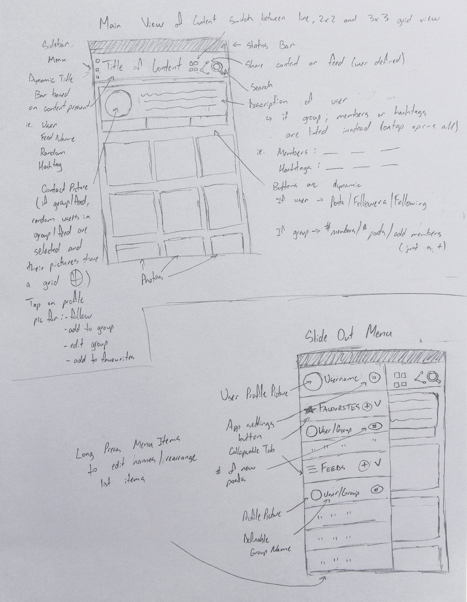
I tried to provide enough information about user flow to make it clear to someone looking at the mock up how exactly a user would interact with the application, as well as what they would expect when they pressed on certain elements.
Phase Three: Refinements
Having selected on a design, it was time to make a higher-fidelity mockup. I opened up Photoshop and began transferring my sketch into a more true-to-production visual prototype. During this process, I continued to iterate and refine my design as I noticed friction points that I had previously overlooked.
Moving from a pure sketch to a “production-esque” mock up allowed me to more critically assess my design and make improvements on the fly. Rapid iteration during these planning phases was key as it allowed me to optimize the design before moving forward.
Outcome
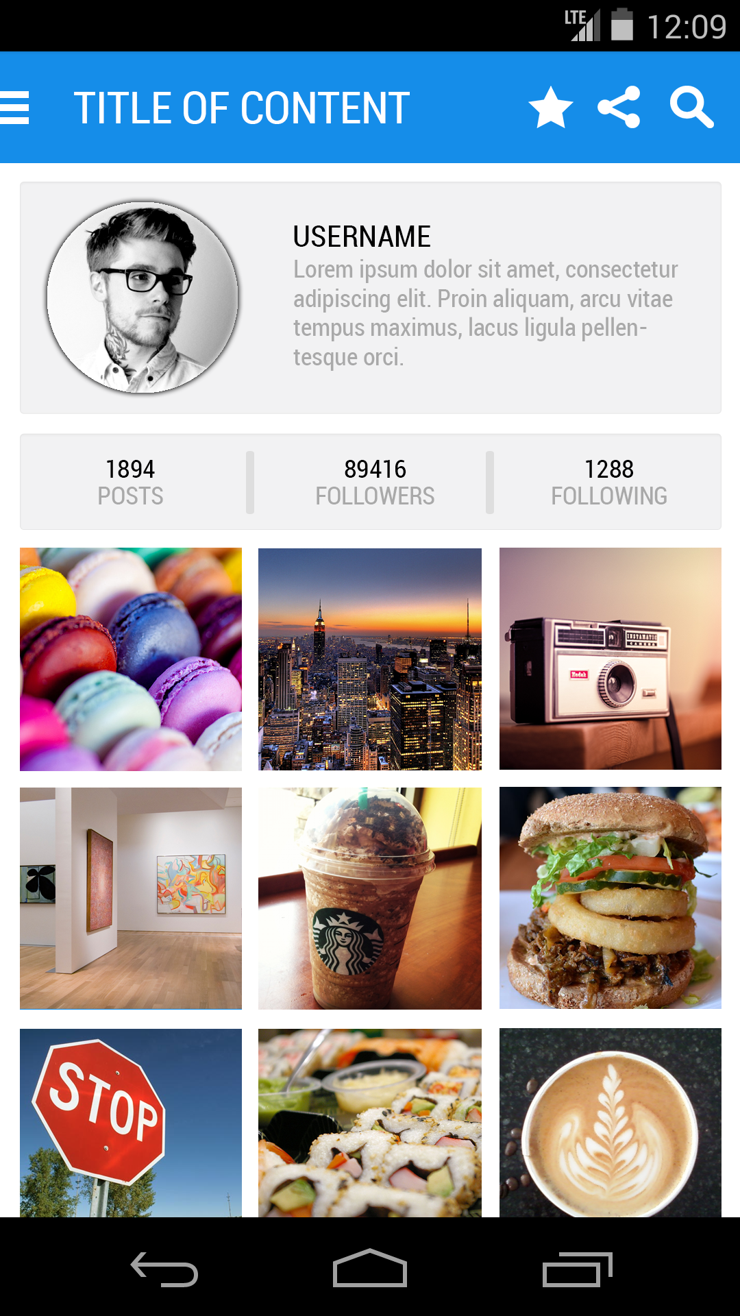
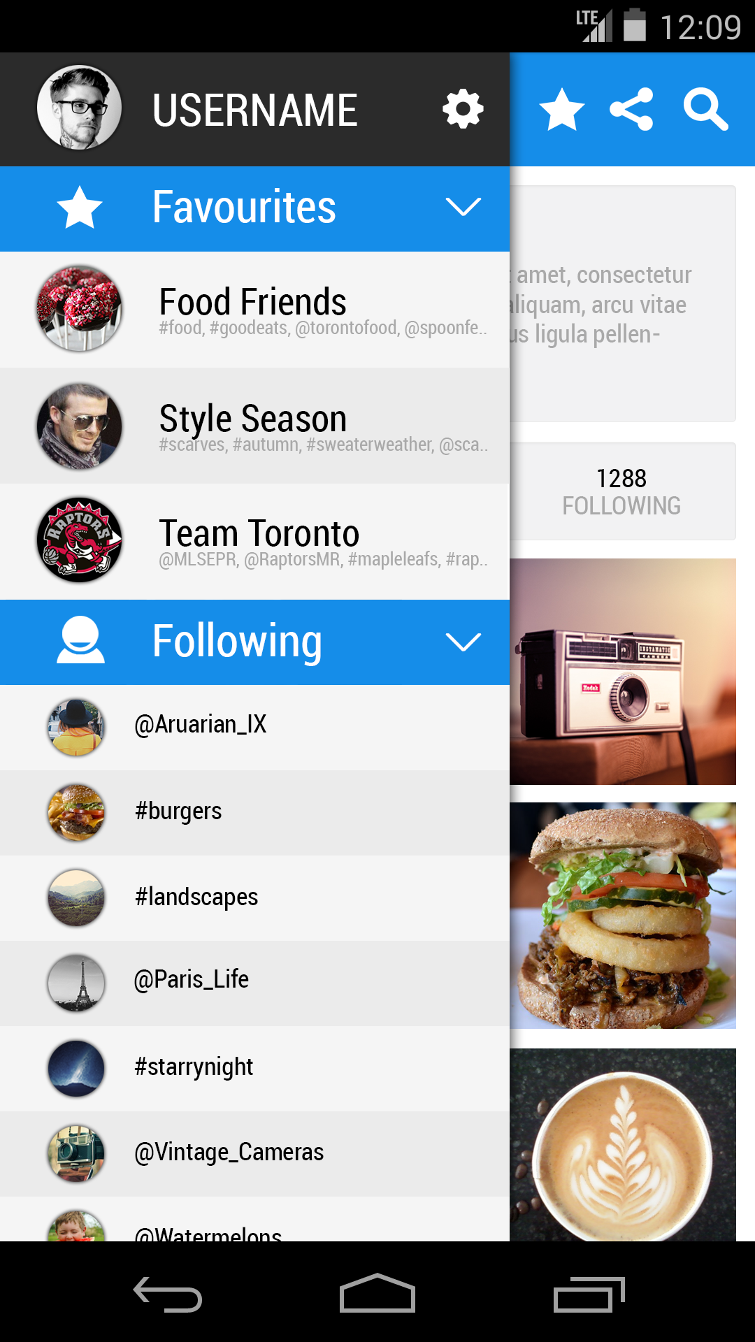
Here are the results of my many rounds of designing. At its time of inception, material design was in its infancy stages and holo design very much still prevalent. Design cues were taken from both philosophies, and so a transitional-style between holo and material design was used.
Reflection
This was the first time that I seriously attempted to revisit a UI and improve an app’s UX. While designing, my one of my goals was to keep the base UI familiar, while updating the user flow to be more inline with other, more modern, applications. Google applications and news readers were main sources of inspiration. I felt that these applications served a similar purpose in terms of the type of content being served to the user, and would be a good place to start in terms of updating the design.
Another one of my goals was to extend the functionality of the interface and services while keeping the user experience simple and clean. Having made detail notes beforehand really helped to identify the areas that needed improvement as well as how and where new features could fit in to the updated design.
In taking on this project, I really got a better understanding of the the importance of a good UI/UX. While the service offered by Instagram is great, there are many areas where it’s UI/UX could be improved. Even as someone who uses the services regularly, I often find myself digging through menus and not being able to find certain functions, or being confused by the user flow when I click certain buttons.
Easy to navigate menus and fulfilled expected outcomes when pressing buttons are huge factors to take into consideration when designing applications. Having completed this project, or at least one stage of a full-blown redesign, I have come to appreciate services that not only excel at the functionality that they are designed to offer, but that also have a solid UI/UX to back them up as well.