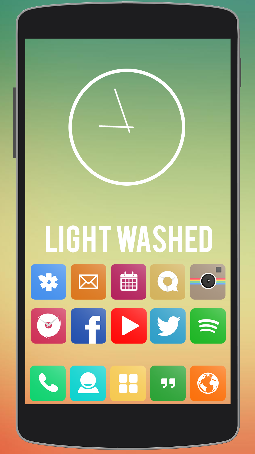
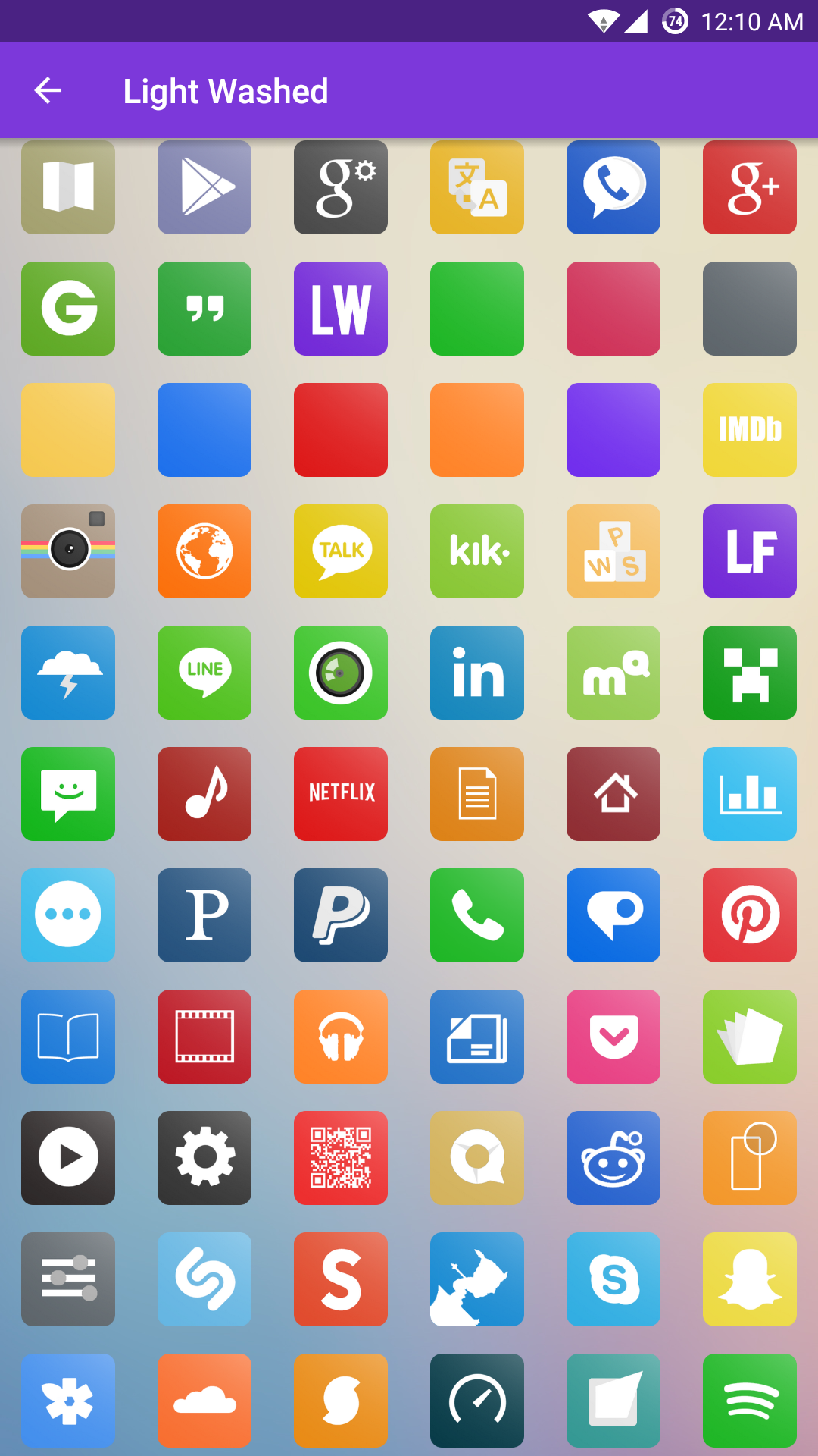
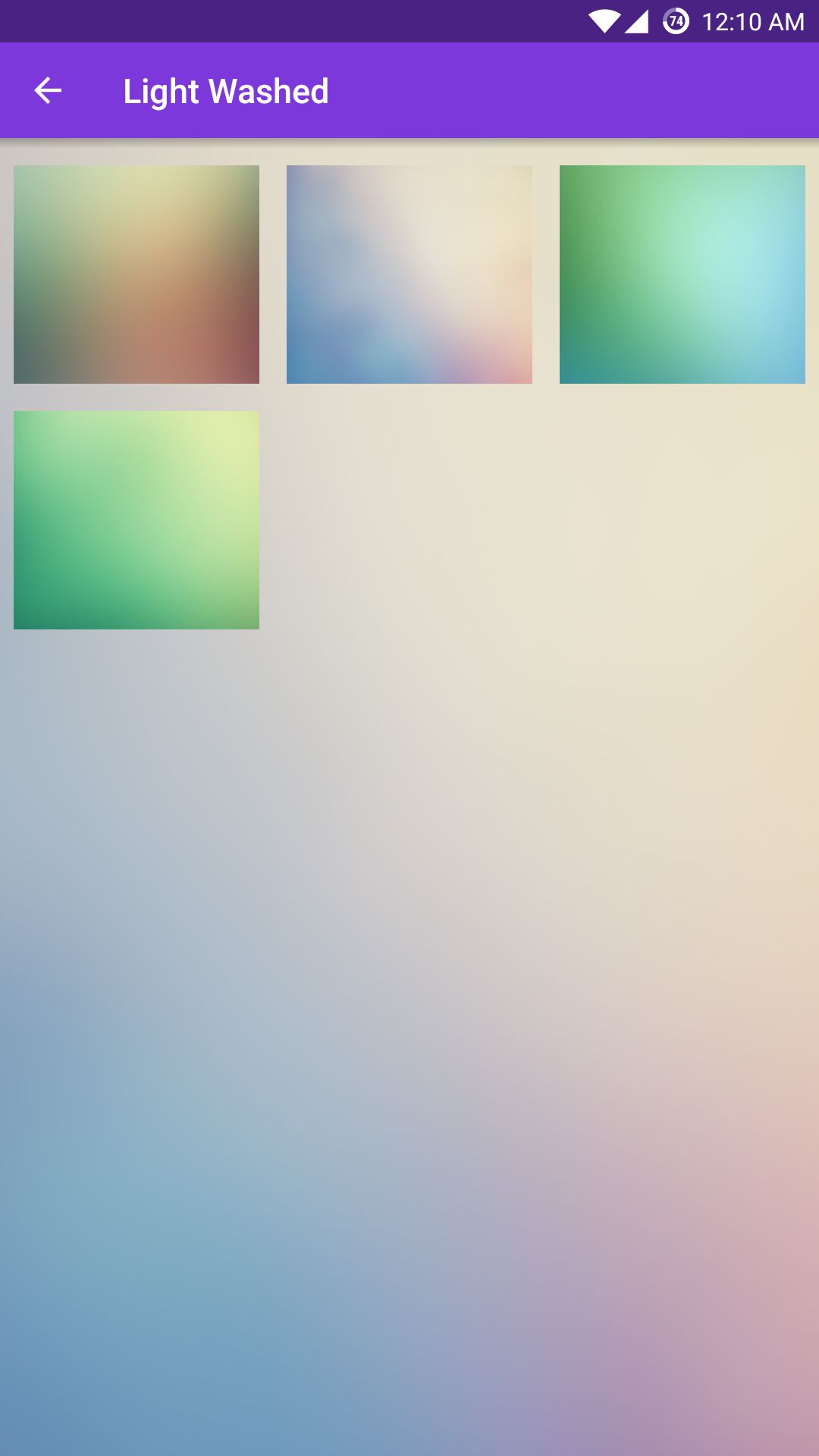
"Light Washed" for Android
A colourful, yet minimalistic Android icon pack, created to unify the homescreen experience.
Links
Tools
Java, Eclipse (Android SDK), Adobe Photoshop
Inspiration
I have always been an avid themer and customizer. It all started when I first learned that I could change the icons on my desktop to whatever I wanted them to be. I remember scouring the Internet, looking for the best icons to use.
When I got my iPhone, I remember looking for ways to customize the icons and menus to my tastes. I found a way and the addiction to theme my heart out began once more.
Then, I got my Android Phone. Theming was infinitely easier and more flexible, at least in terms of what I was looking to do. I got hooked again. But this time, I decided that I wanted to make something of my own. Having years of Photoshop experience behind me, I said to myself, “Why not? ¯\_(ツ)_/¯” and began creating my first icon pack. It wasn’t much, but it was something.
I then decided that I wanted to make a full-fledged pack that could be distributed on the Play Store. Having very limited Java-knowledge at the time, it was going to be a challenge. But having just recently discovered a passion for programming, it was a challenge that I knew it would be a challenge that I was more than willing to take.
Process
Design
I wanted to create an icon pack that I would use. At the time, the icon pack scene was pretty well defined, so finding my own style proved to be a bit of a challenge. My goals were consistency and simplicity.
Initially, I chose to sample a colour from the application I was theming and use it as an icon base. Then I would whiten and “minimalize” the original icon using grey as the accent colour and center it within a uniform shape. After the initial batch of icons were created, I took a second to look at them found them to be too plain for my tastes. I added a white gradient overlay to “wash” the icon background and thus “Light Washed” was born.
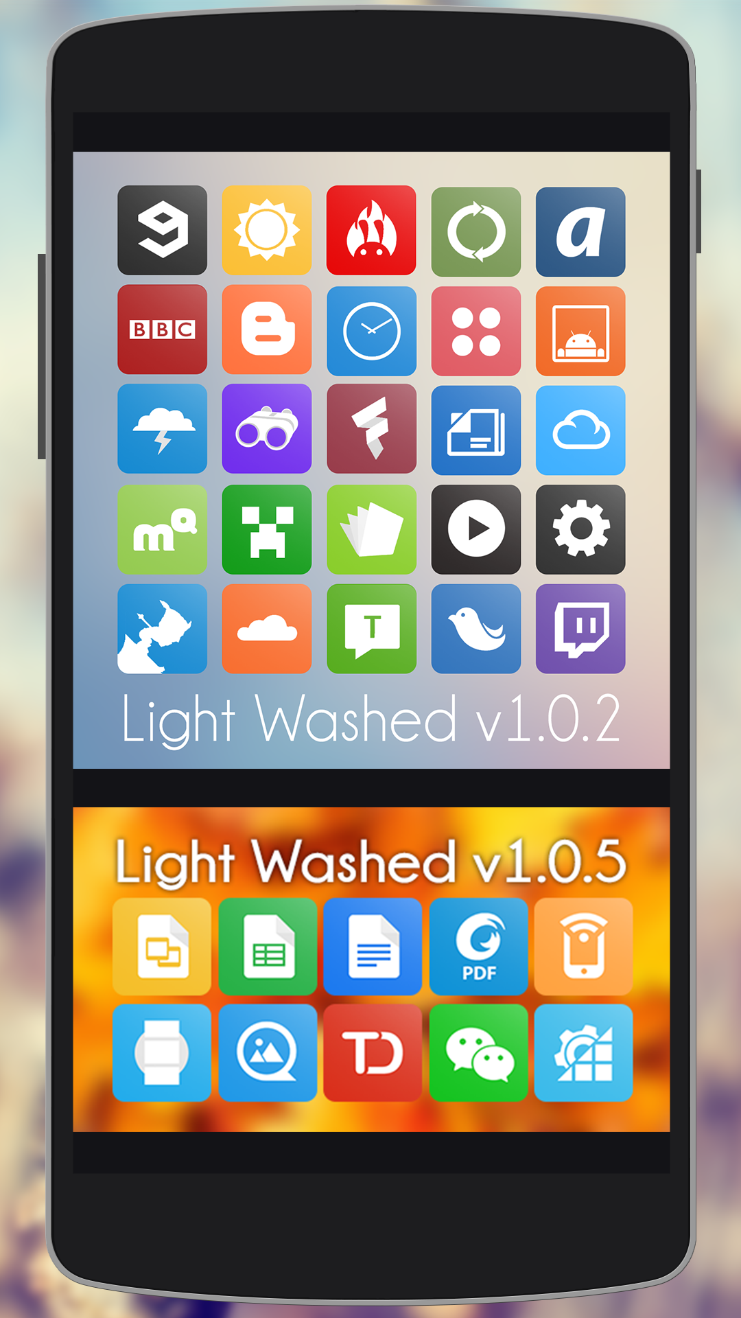
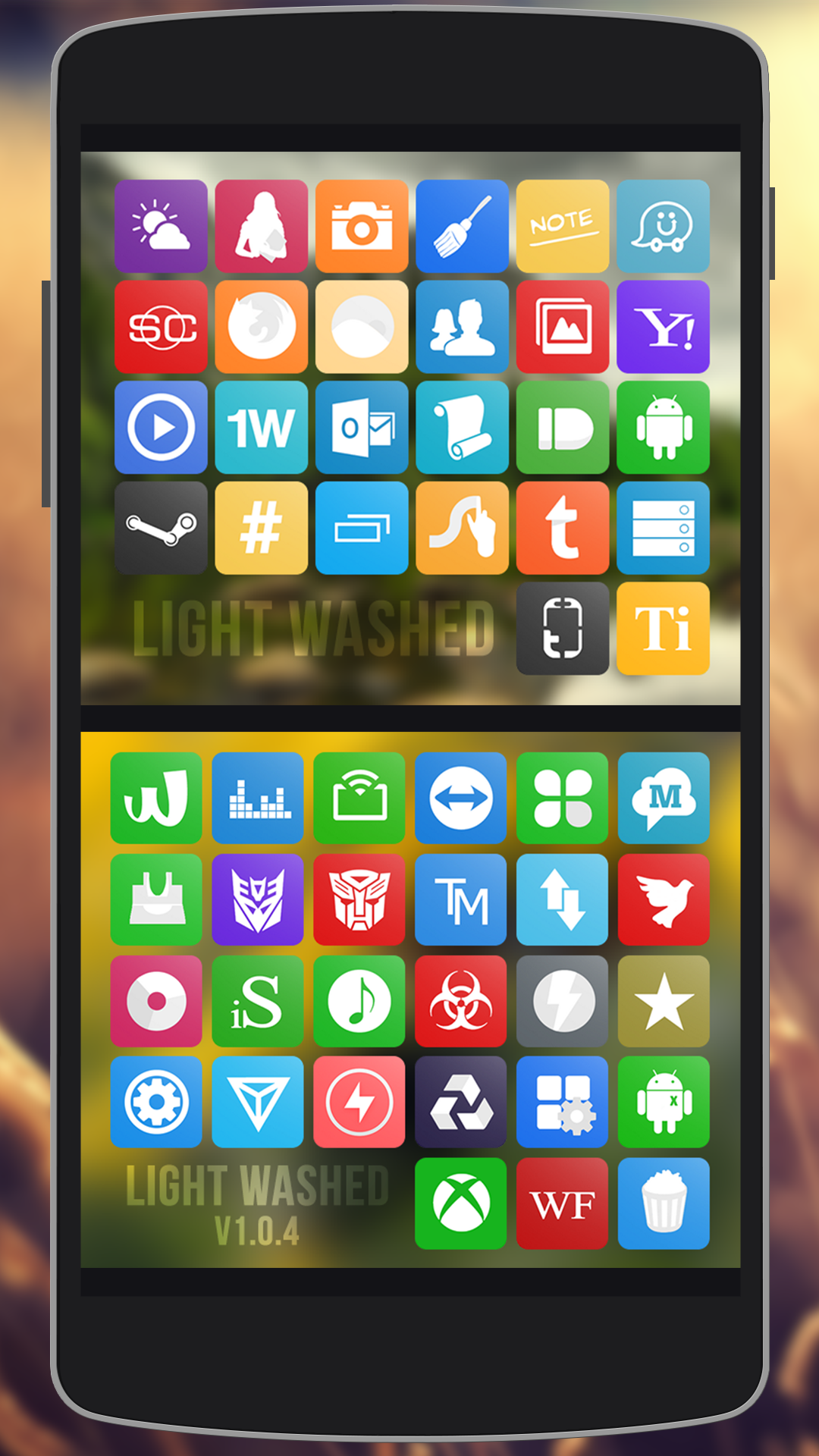
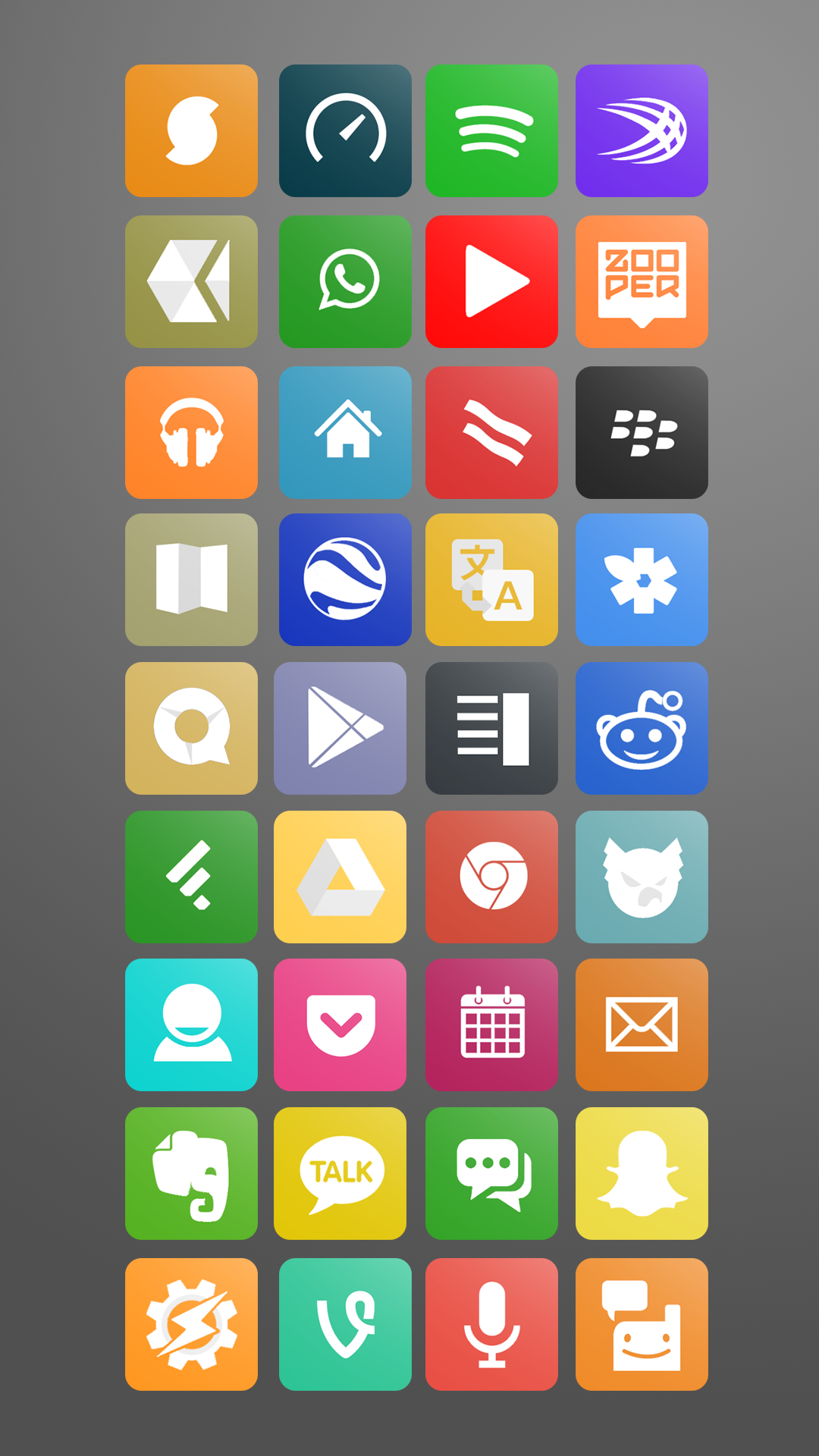
Shortly after creating the first batch of icons, I decided that I would limit myself to using 8 different colours for the background shapes as it would provide a more uniformed look and feel.
Preparing for Distribution
Having created a sizable number of icons, it was time to create the APK to distribute them. Easy enough right? Not quite so.
I spent days upon days reading documentation and tutorials about how to create an Android app specifically for distributing an icon pack. I watched every video that I could get lay my eyes on, and even turned to other designers and developers to ask for their assistance.
After many trials, an APK finally compiled. Success! Estatic, I rushed to install it on my phone.. and nothing worked. Back to tinkering. A countless number of trials and StackOverflow queries later, I finally got the application working. Words cannot express how exciting that moment was. I had finally conquered the mountains known more commonly as Eclipse and Java.
I released the APK to the Google Play Store, and posted on a couple forums asking for feedback. Mission accomplished! My first submission to the Play Store was live and selling.
Outcome
Reflection
I had so much fun with this project. I even have plans to create an additional icon pack. Being both a design and a developer, this project was a pleasure to work on. It did not even feel like work most of the time.
From a design point of view, this project was a blast! I got to express one of my styles through this icon pack and share it with the world. Not only did I get to practice my Photoshop skills, but I was also challenged with creating a uniform, consistent style - something that I had previously not had much experience with. Creating a theme from scratch and maintaining unity among each individual icons is a very different process than manipulating one off photographs or creating digital art. But nevertheless it was fun challenging myself.
But the real challenge came from developing the APK to distribute the app. Having had limited of knowledge of Java and Android development going in to this project, I feel that I was really able to learn a lot by just hitting the ground running and finding out ways to solve my problems as they showed up. It helped to be perseverant too; there were times where I would not stop Googling and trying any reasonable solution that I came across until I got the app working.
I also met some pretty amazing people along the way. I reached out to many developers creating similar applications to mine, and, much to my surprise, many of them were more than willing to help me out. I could not have done it without them, and their help truly helped me appreciate the value and importance of teamwork.
Ultimately, once I had launched the app and everything was set in place for easy maintenance, having real people email me with feedback, icon requests, and even just nice words was really gratifying for me. Although I had spent almost too much time creating the icon pack, my hard work paid off in the end. Interacting with real users that were using something that I myself had built was a feeling that is hard to describe. It was unreal knowing that I was just as much a part of someone’s device as their wallpaper.
Moving forward, I have continued to update the icon pack with both user and personal icon requests, and have even overhauled the pack a couple of times for better uniformity and higher-resolution device support.